Fueling Impact: Designing Calm and Trustworthy Spaces for Fuel Organic
View project on Behance
Fuel Organic is a health & nutrition supplement brand that focuses on making a real-life impact apart from setting distribution across northern America.
Type
UI/UX & Packaging Design
Client
Fuel Organic
Industry
Health and Nutrition
Team
1 UI/UX Designer
1 Graphic Designer
Timeline
20 Days
Project Link
Behance
Goal
The goal was to create a platform where consumers can buy products and understand how Fuel Organic is making a real-life impact gaining the trust. A facelift that resonates with their brand ethos, reflecting simplicity, energy, nature, and seamlessly with their good social values.
Challenges
The challenge was to create a cohesive brand identity across both digital and real-life assets, as there were no existing brand guidelines. Additionally, designing the platform for a broad age range, from 18 to 65 years old, required balancing aesthetics with usability while keeping the diverse audience in mind.
Outcome
Discovery
How I started
The product and marketing team from Fuel Organic needed a web presence that could speak for their brand and sell their value. I initiated the requirement-gathering process and created a structured scope and strategy document to begin with. Leading to understanding the customers better.
Research
Initiating the project journey and user research sets the foundation, aligning client vision, preferences, and project goals. Also, during the research I came across a problem that users had lack of trust in the brand.
Design Conceptualization
From UX aspect
User Flows and Navigation:
Create user flows to map the journey from entry to conversion.
Define a clear navigation structure for a logical and intuitive user experience.
Information Architecture:
Organize content in a manner that aids user understanding.
Prioritize information hierarchy to guide users through the intended pat.
From UI aspect
Visual Design and Aesthetics:
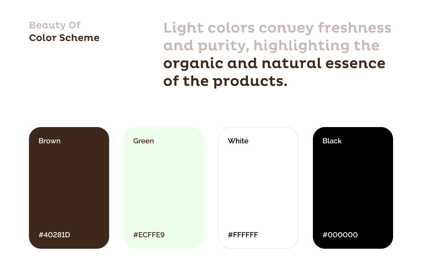
Design a visually appealing interface that aligns with the business needs while catering to fresh and friendly vibes.
Use a consistent color palette and typography to maintain brand cohesion across all pages.
Responsive Design:
Ensure the design is fully responsive, providing an optimal viewing experience on all devices, from desktops to mobile.
Focus on maintaining the balance between aesthetics and usability across different screen sizes.
Interactive Elements:
Create interactive components like hover effects, animations, and transitions to engage users without overwhelming them.
Design intuitive buttons and call-to-action elements that stand out and guide users smoothly through the website.
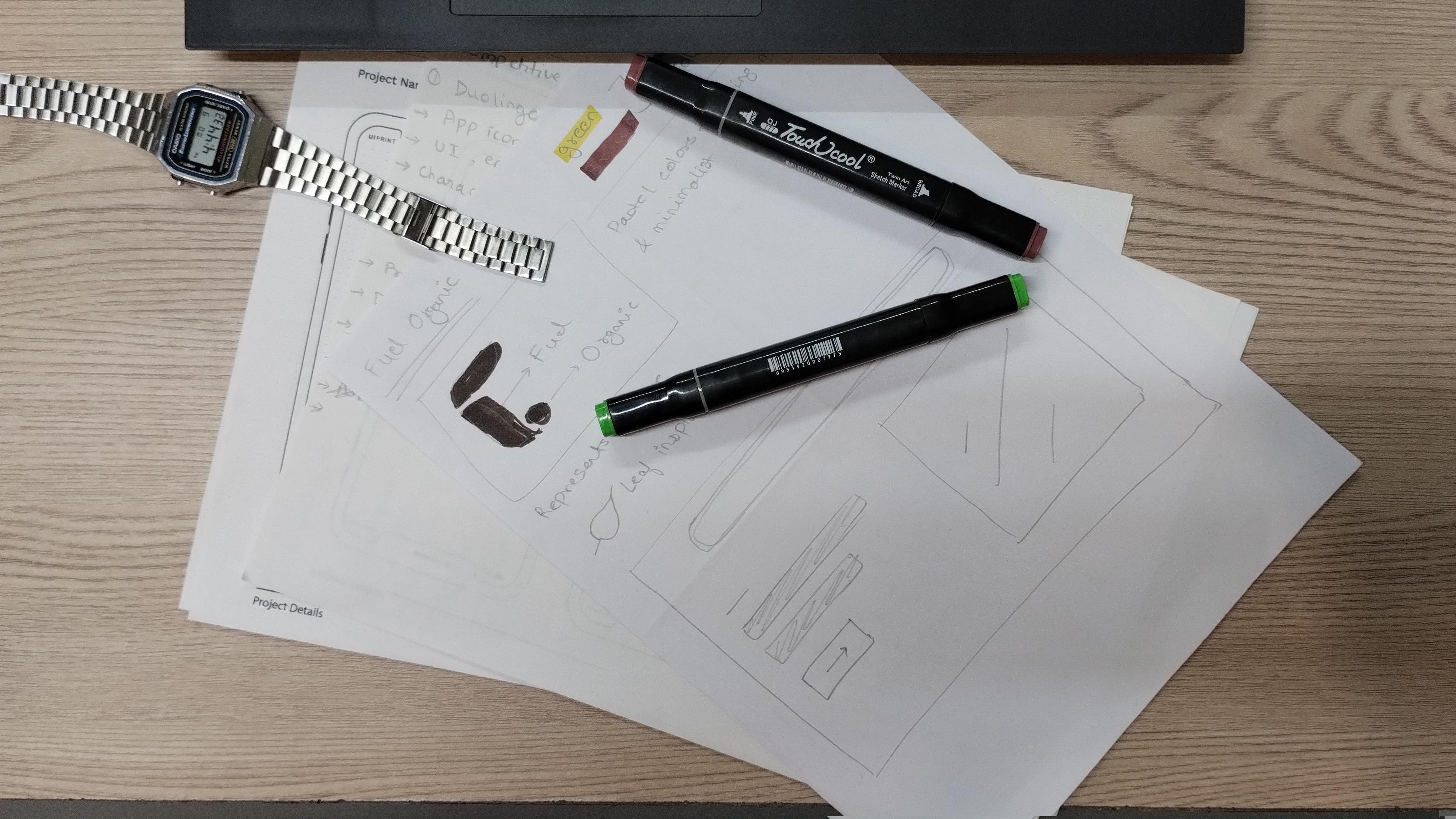
Design Creation
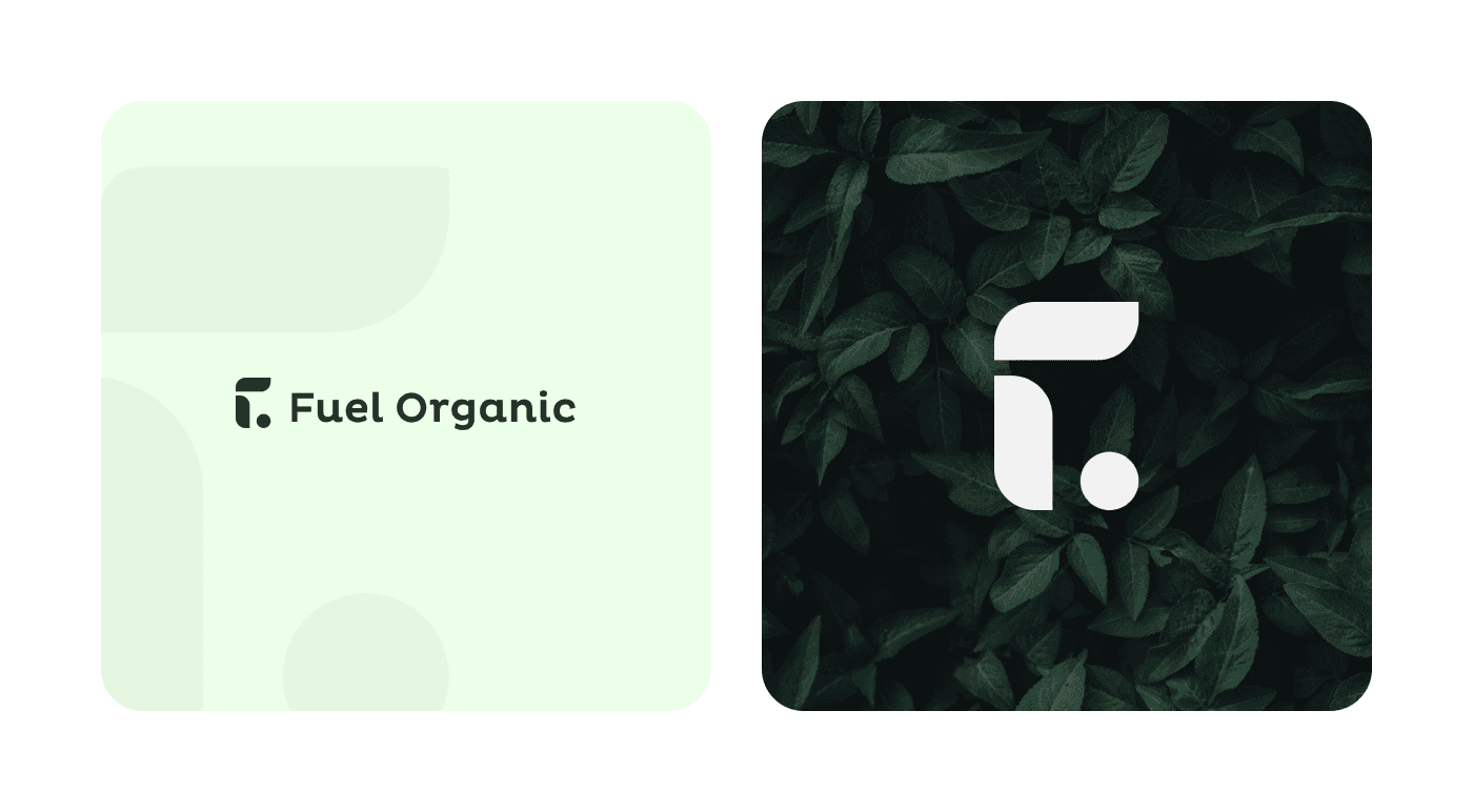
Crafting Design Language
Develop diverse components for a cohesive design language.
Define styles, ensuring consistency and aesthetic appeal.
Enhance user experience through visually engaging design elements.
Iterations and Design Sprints
Gathered client feedback to inform design iterations.
Iterated designs, balancing creativity and user-centric improvements.
Optimized the design based on thorough user research and testing for optimal results.
Outcome & Impact
Final Design
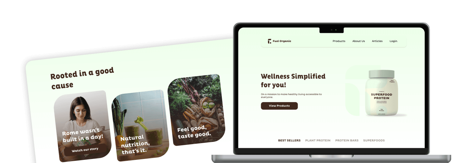
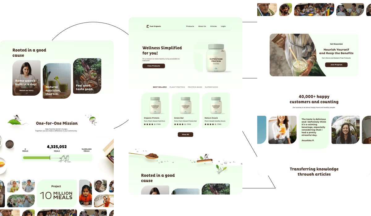
After multiple days of iterations and team discussions, this design was finalized. It had a consistent, well-crafted user-centric experience and interface.
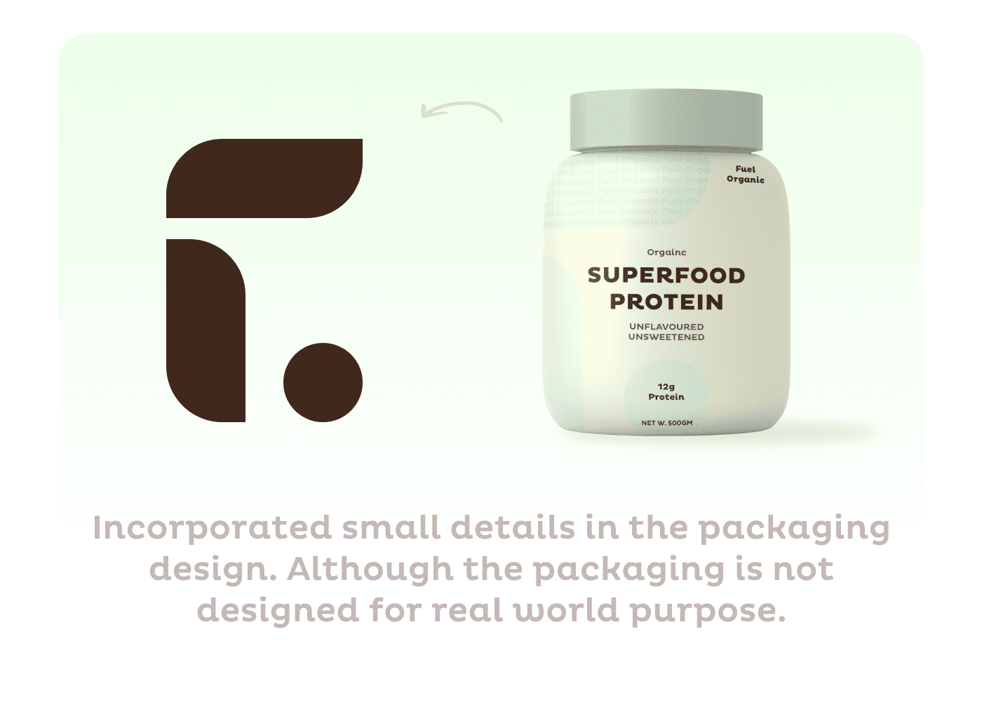
I also designed the packaging for the health supplements. The mentioned mockup of the packaging design was not the final product. It was revised according to the business needs.
Impact
The design was completed and finalized before the timeline. It saved hug effort and time for the whole team.
The website and the user flow for the checkout flow made a great impact on the business as the drop-off rates were suddenly reduced by 26% and the social cause displayed on the website was loved by the users, leading to more sales of the products.
Want to see complete design?
View Design